

5 (More) Tips to Make Your Content Flourish
How do you make your content even better with all the strategies proposed by top-notch online marketing gurus? There is a handful of effective ‘to-dos’ to create attention-grabbing content that resonates with your audience. The message of your content will have to be clear and crisp, both in written and visual formats.

Let’s take a look at other strategies to use to boost your website’s overall appeal.
Fonts
Typography plays a big part in announcing your brand and making content on your website visually appealing and readable. While fonts are fun to play with, using too many fonts is a visual atrocity.

Img Credit: sign.com
Stick to one to two types of fonts you want on your website. Font examples such as Tahoma, Arial, Verdana or Ubuntu are good fonts to use as your staple font. The fonts will have to be readable in both website and desktop formats; too big is distracting and too small is an eyesore. Keep it clean and consistent throughout. Only use big, bold fonts for headers and subheaders.
Avoid using sophisticated calligraphic or cursive fonts since many computers do not support them. Additionally, there is a handful of people who are unable to read curly and cursive fonts. Only the brand logo should use fancy fonts (when necessary).
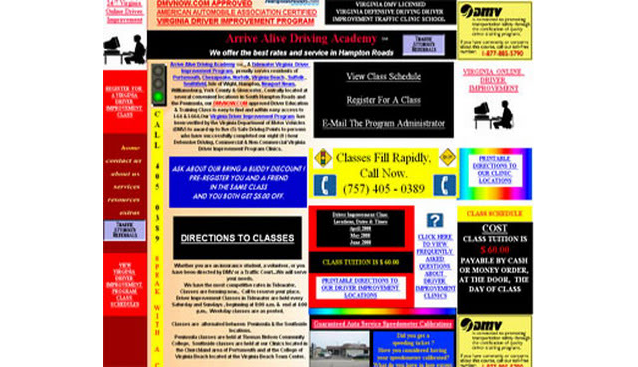
Visual Atrocities
Website color combinations matter. Pick out colors that are easy on the eyes to give your website a ‘wholesome feel’. Depending on the type of business and niche, colors draw people in, whether they are interested or not. Consult with your graphics team and website developer to determine the best types of colors for the website. Avoid using twenty colors on one page, coupled with five different font variations:
Img Credit: photobucket.com
Filtered Images
Pictures, as nice as they are, do not necessary need over-the-top filters to beautify your posts. Filtered images seem nice and artsy but in actuality, they are distracting and takes away the ‘purpose’ of the post. For content creation purposes, it is advisable to use simple, high-quality images that relate to your material.
If you have issues finding the right image(s) for your content and website, here are some excellent resources to consider:
- Shutterstock (Paid)
- iStock (Paid)
- Pic Jumbo (Free)
- SplitShire (Free)
- Dreamstime (Paid)
- Getty Images (Paid)
- Freepik (Free)
- Unsplash (Free)
Sections Matter
Content becomes unappealing (even if it’s well written) when viewers enter and spot huge slabs of text with no subheaders or images to break the flow. Unfortunately, this attributes to high Bounce Rates. If your aim is to look professional and polished, always remember to section things off. Your website is not an essay. It is a place where people come to read and learn more about you and your brand.
Balance out your texts according to each section and support them with images and examples.
Too Many or Too Little CTA’s
CTAs or Call to Actions should not be too overwhelming or underwhelming; it should be just right.
Remember, Call to Actions should be consistent throughout the website, and one should never abuse it. There are many excellent ways to create compelling CTA’s using the correct terminology to peak each user’s interests.
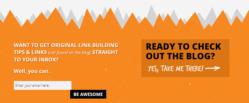
Img Credit: wordstream.com
In the above example, the website would like its readers to sign up for their newsletter to receive exclusive tips and tricks. Additionally, the website slips in “(not found on the blog)” for added measure. These simple words evoke curiosity from the reader; what tips? How can I make use of these tips? Does it give me a competitive edge?
Next, the unique CTA. Instead of using the terms, “Sign Me Up!” or “Click Here”, the CTA is “Be Awesome”. Who doesn’t want to be awesome and gain in-depth knowledge on how to enhance their link building strategies, delivered directly to your inbox?
Ultimately, this is just a fraction of how to create solid and appealing content for your website. Should you need help figuring out how to create the perfect website design or devise a rock-solid content strategy, get in touch with us!